Critique for Arthur
After every workshop we give attendees the opportunity to send in post-processed and finished images for a critique, this may cover everything from great photos for approval or failed photos for advice. We try and give information for correction of images wherever we can.
This is Arthur's set from our recent workshop in conjunction with the Royal Photographic Society.
My first comment which I'm not going to repeat for all images is that they all look slightly dark to me. This is probably due to an uncalibrated monitor. Most monitors are by default set for being over bright since that gives "punch" to the display, but leads to a misleading view of images.
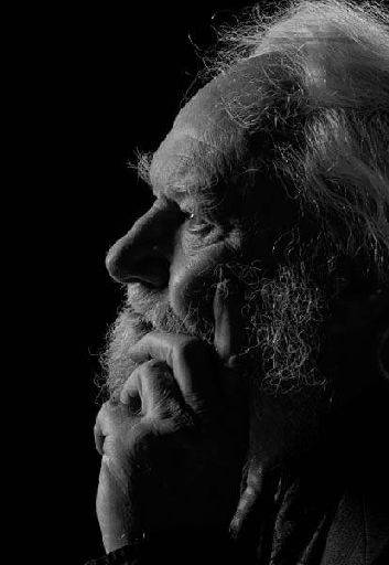
Cracking image, lovely perfect of Denis. The light across the face is terrific, the highlights on his hair. Only one minor criticism is that it looks like his finger has slightly pushed his cheek out of shape.
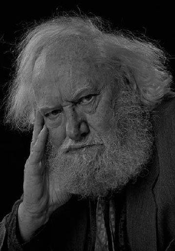
He does look grumpy !! Everything is fine except he's missing a catchlight in the eyes which makes him look a little dead.
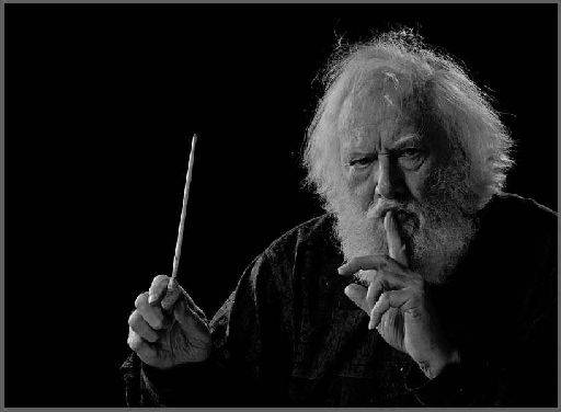
Again perfect shot, love the baton, getting the placement of all the elements right in this type of image is tricky but this is very well done. You could possible lose a little off the left edge to give a stronger composition and crop. Again sadly it looks like there is no catchlight which would help a lot for this image.
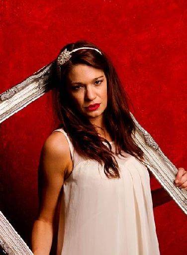
Not sure what's happened here, the background should be bright white and the hair is quite "muddy", which I think is a post-processing problem. The expression is interesting, the palm could have done to be turned just slightly more into the face. I think this can be cropped much tighter for a stronger image.
Almost there but somehow the face and the pose don't gel for me. The crop is too tight (a mistake I make a lot too), the image needs a bit more space on the right. The background should be white.
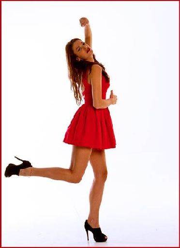
This is good fun, I like the expression in particular, Brodie looks very happy and natural. Under normal circumstances I would complain about the bunched knees, but I think they are fine here. The stool is a problem because it gives a very complicated base to the image.
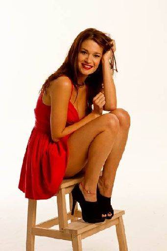
Again, very close, but the crop really lets it down. There's too much head room and by losing the fingers, and the left top corner everything looks cut off.
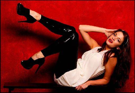
Good fun, nice pose shape but it's let down by the hands, the top hand has too much palm showing and the bottom hand is too clenched. The expression is close, but I would say you were probably a fraction of a second off getting something terrific.
Lovely. I suspect this would make a great black and white. You could also try cooling the image just a little to bring out emotion in the image
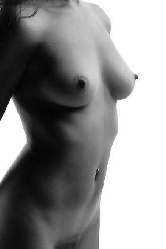
Nice mono nude study. I like that the head is cropped out which lets us concentrate on the figure and form. Be interesting to see how either adding or reducing contrast on this image would change it.
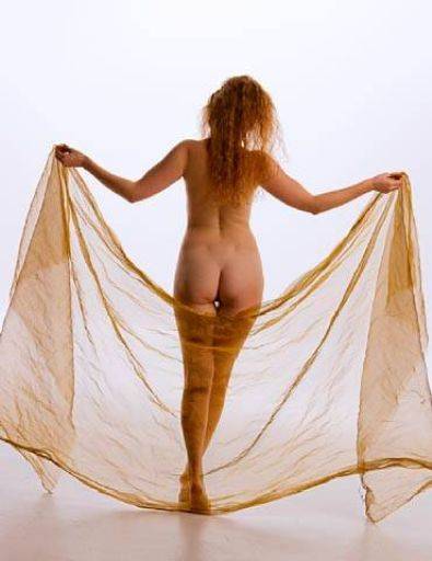
Sharon is wonky, she needs straightening up a little. This is a nice gentle pose and crop, I would look at reducing the contrast and or softening it as well.
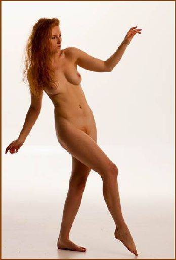
I like this shapes here, the hips look a little bulky, a slight turn away would help. Again it is very gentle so have a play with contrast and softness.
Overall a good set, I particularly like the shots of Denis.
share:
I run regular workshops for beginners and experts alike. I like to run a mix of styles and types. Masterclasses, portfolio builds, technical and artistic sessions available.
Current courses available.