Critique for Ken B
After every workshop attendees can submit images for a final critique - this is a valueable part of the learning process.
These images were taken at our recent workshop with Lulu Lockhart at Image Red studios by Ken B.
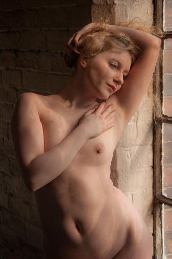
Nice starter shot, the light actually looks nice and soft - which is a bit of surprise considering the day - I can only assume we had a little cloud cover when you took this shot.
There is something odd going on with the light - I wonder if it is reflections of the puddle, but it almost looks like Lulu has cellulite all over her body.
The bigger issue is that body is widely lit and square to the camera - this makes the whole body look very wide. Body and/or camera would be better at a different angle.
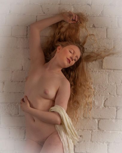
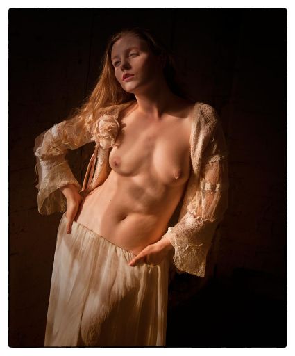
I like the overall classic look to this image, the hands, the hair and the drape are all interesting and give strong echoes of the "old masters" .
The white vignette is horrible though!! It is not an image that needs it and just doesn't work here.
There's also a bit of an odd balance to it. The body is really too far to the left of the frame - you cold do with some more wall on the left of the image.
The lighting is so soft throughout - which is not an issue with this image, but you do need to be careful.
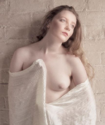
Nice treatment here for the soft look throughout and the exaggeration of Lulu's pale skin. The framing works very well, both the overall frame and the internal framing of the drape and torso.
The gaze on the eyes is strong despite being indirect which works well.
The eyes could do with not being softened quite as much as the rest of the image. You always want the eyes to be sharp.
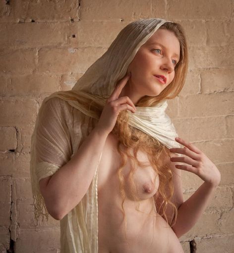
It is very intersting to compare this and the previous shot. Only a minute or so apart yet what a different feel. I really like this image, the expression on Lulu's face is really good - a sort of relaxed happiness - definitely of the moment.
The tones across the image work well - none of them drift too far from the core tones of Lulu's pale skin, yet all are clearly differentiated, from the skin, the cloth, the walls and the shadows. So all you are left with as distinctive are the lips and eyes. Works very well.
I really like the way the hand shapes and positions feed into the lines with material and there are good echoes of line betwen the arms.
The drape covering part of the body has helped prevent the torso looking wide.
I would zap the two black parts on the wall at the bottom of the frame.
On first flush this has a good drama to it, but the loss of exposure on the face is a let down. This could probably be easily brought up in photoshop or lightroom.
Like some of the others Lulu is very square to camera - remember to keep turning your models hips so the side is to camera.
THe many different shadows do work well and there is a really appealling warmth to the whole image. I like the way the figure is so clearly isolated from the background.
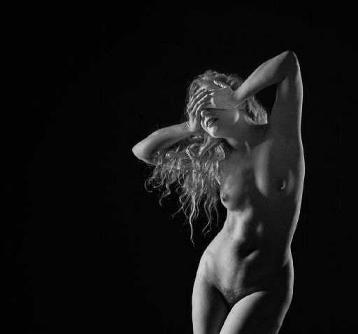
Cool studio shot to finish with. Normally those mashed hands would be a no-no, but they are very effective here. The tilt and twist of the body is very interesting.
You've got Lulu in exactly the right place in the light - with lots of light/shade/light/shade patterns across the body. The hair is well lit from behind and is separated nicely within the triangle of the arms.
I think you may have a second image here which is a landscape image across the face.
Overall you really need to watch your model's position to camera. It is so natural for the model to end up facing you, but you can see in these images how that can lead to less flattering images. Try and get your model to always turn sideways - then it is OK if the shoulders stay sideways or come back to camera.
I would also recommend you try and shoot a little more into the shadow side of things - there is a lot of full on light in these shots. The square body position and broad lighting combine to double the problem.
I do think you've got some good poses and expressions from the model - there has been some good interaction between the two of you.
share:
I run regular workshops for beginners and experts alike. I like to run a mix of styles and types. Masterclasses, portfolio builds, technical and artistic sessions available.
Current courses available.